USPS Deliver The Win
Delivering research-backed recommendations to improve usability and effectiveness of a website providing political campaign resources

The Challenge
Conduct user research with political candidates, campaign managers, and other political actors on the USPS site “Deliver The Win”, a site that offered a suite of political mailing services and a collection of research on best practices for political mail in election campaigns.
Specifically, we were tasked to chart any differences in user needs between roles, party, and region, test the site's content hierarchy and recognition, map logical groupings between content and test the live site to uncover insights on how to best meet the needs of political actors of all sizes.
What does it mean to "Deliver The Win"?
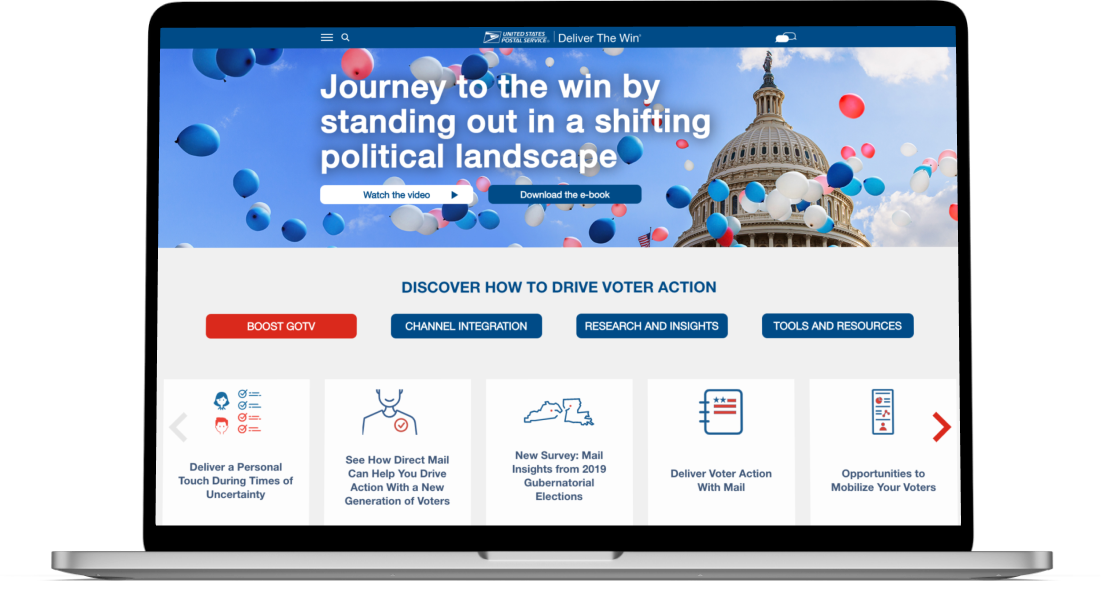
Deliver The Win is an online resource that provides campaign outreach and marketing information for political candidates, campaign managers, and other political actors provided by the United States Postal Service, which sees an incredible amount of volume and creation of political mail each year.
The aim of Deliver The Win is to help candidates break through political noise, share and highlight best practices and little-known political mail services USPS offers, and ultimately help political actors win their campaigns. The site is designed to be an accessible, non-partisan resource that campaigns large and small would turn to when creating political strategy. However, USPS needed to ensure they understood the needs of the users they were catering to to make this information both appealing and accessible in a sea of political information available online.
These research questions shaped our work:
How did users feel about the information this site offered compared to the other resources available to them?
How do the needs of users differ? What's important to a campaign manager vs. the candidate themselves?
Do users understand the navigation, and do the categories make sense to them?
What parts of the site's UX causes frustration or confusion for users?
Project Timeline

Project Briefing

Walkthrough of site

Cognitive Walkthroughs conducted

Card Sorts conducted

Data Synthesis and Analysis

Presentation of insights and recommendations
Research Methodology
In order to fully capture the needs and behaviors of this site’s different users, we created a comprehensive research plan that allowed us to address all of our research questions.
All in all, we worked with 40 different participants during this project. Our cohorts were divided by their role in a political election, such as campaign manager, political consultant, or candidate, and contained a representative mix of political affiliation, age, and community (rural/suburban/urban).
For this study, we talked to each participant for 70 minutes, and our time talking to participants was divided into two parts:
All participants took part in a 30 minute user interview session, with the goal of understanding the existing landscape of political mail and gathering background contextual information from our candidates. During this interview, we heard from people who had held positions in political campaigns or races over the last 2 election cycles. the discussion focused on the types of campaign methods they used, how they used them, how the research and planning process of a campaign plays out, and the type of information they would expect to find on a site like Deliver The Win.
After taking part in these user interviews, our participants diverged into two cohorts: One group of 20 explored the site during a cognitive walkthrough, while the other 20 participants provided feedback on the grouping and organization of the site’s content during a card sort.
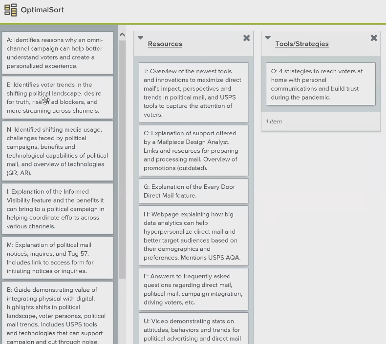
20 of these participants took part in a card sort, which provided valuable insight into how the site's content should be grouped and organized. The results of the card sort helped us understand how users' needs and mental model differed, depending on their role in a campaign.
The other 20 participants took part in a cognitive walkthrough of the site, in order to understand how best to adapt the site to meet their needs. Cognitive walkthrough participants gave us insight into which parts of the site caused frustration or confusion, as well as an observation of how participants used the existing navigation.
My Role
Understanding the Problem
I worked alongside two other researchers, Mark Becker and Bill Saiff, to analyze the results of user interviews, and to design, conduct, and analyze the card sort and cognitive walkthroughs. While conducting this card sort and cognitive walkthrough research, I applied my personal moderation style, adapted from Rogerian therapy, focusing on restating a participants comments and allowing them to elaborate. For analysis, card sort data was analyzed using dendrogram and cluster methods, and cognitive walkthrough data was analyzed using content analysis and grounded theory methods.
Our team presented the insights and recommendations gleaned from this research to business drivers and key decision makers in January 2021.
Key User Interview Insights
Each phase of our research presented us with some unique key insights. The biggest takeaways from our user interviews were:
Door to Door and direct mail are king.
We found that the two most common, and most effective, campaign outreach strategies involved door-to-door and direct mail outreach. This was in line with previous research and assumptions we had made about our users, and justifies design decisions made about direct mail, both the amount of emphasis and level of detail provided on the site.
Direct mail was not commonly tracked, and the effectiveness was hard to quantify.
Although 92% of our participants had used direct mail before, there was no clear way to track the delivery progress of these 'mailers', and no real way to quantify their effectiveness. Only 5% were aware that USPS (who hosted and developed Deliver The Win) provided a free tracking service that provides mailers notifications as each mail piece, bundle, tray, sack, and pallet is processed and scanned throughout the postal network. This led to participants developing workarounds to gauge when their mailpieces had made it to voters, including one campaign manager who described sending interns to local post offices and having them dig through trash to try and find their campaign's mail.
“The more information you get about when ballots drop, and when they get returned… that information is extremely valuable.”
The smaller the campaign, the larger the role social media played.
Smaller and localized campaigns mentioned social media as a key part of their campaign strategy 75% of the time, while for medium size or larger campaigns, social media was key to their strategy only 23% of the time. The important conclusion for Deliver The Win to draw is that these small users will gravitate to outreach methods with easy ease of access, broad reach, and inexpensive cost, and direct mail should be marketed as such on their site.
Key Cognitive Walkthrough Insights and Recommendations
Analysis and Uncovered Insights
Our cognitive walkthroughs of Deliver The Win were full of eye-opening observations; while we observed many elements that worked well and resonated with participants, some elements and interactions frequently impeded participants from their goals and took away from their overall experience. Our team noted these interactions, and included recommendations for how to improve or mitigate these experiences.
Initial Impressions; Starting off on the wrong foot
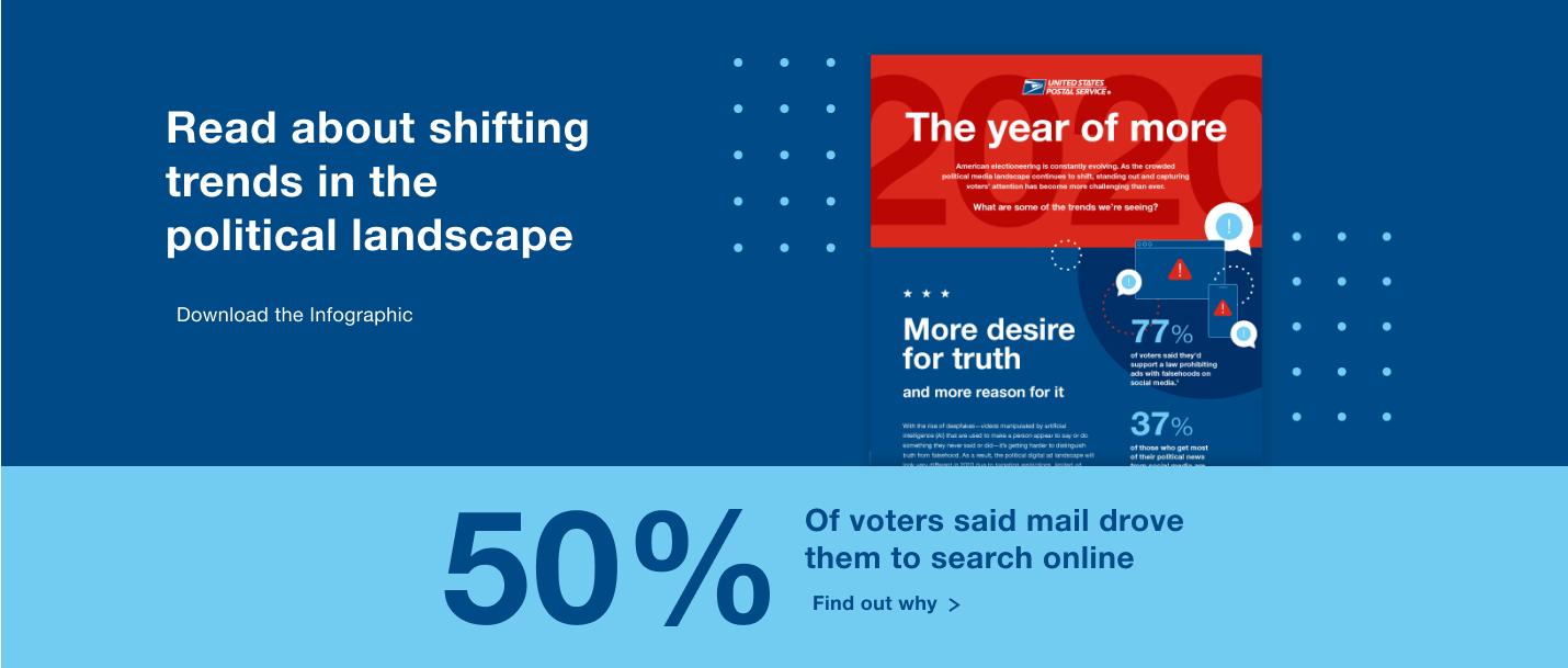
Users didn’t immediately understand the context for the site, and the information it provided. The prevaling impression was that it was an e-commerce site where they could buy direct mail services, or voter research and data.
In reality, Deliver The Win is a free resource repository for information on those topics.
The hero section included a button for a video which provided context and a comprehensive overview of the site. However, most participants indicated they would normally not watch videos on sites like these.
The fact that the rest of the site was so easily identifiable and contained content familiar to participants was discouraging users from watching this video.
"Since most of the site is so easy to understand, why would I need to watch the video?"
Our Recommendation:
Recrafting the hero section would help frame the purpose of the site to visitors immediately. This recrafted section should give users an idea of how the content of this site will “help drive voter action.” Pulling key ideas from the video would also provide additional context, and would prevent it being a neccessity for users to watch the video.
Categorization of voter insight content negatively affected user opinions
There were several issues with the navigation and controls for the 'Carousel' of voter insights content.
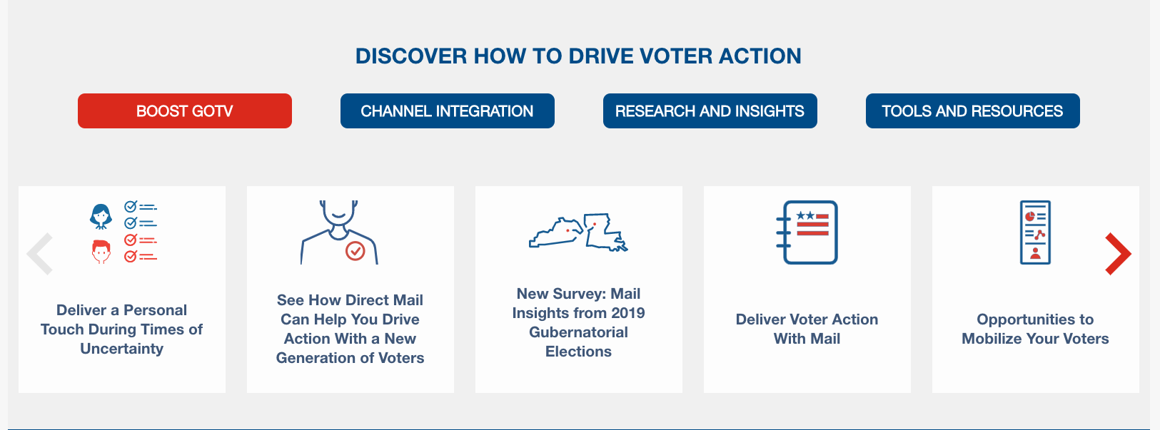
The intended way to cycle and filter content was to use one of four buttons, labeled "Boost GOTV", "Channel Integration", "Research and Insights" or "Tools and Resources". Participants didn't understand what these labels meant, or how to use them to control the 'carousel'.
When using one of these buttons to change the displayed content, participants noticed a 'shuffling' animation as content changed to match the newly selected category. This reminded participants of a shuffling deck of cards, and caused many participants to draw the (incorrect) conclusion that the content on this 'carousel' was randomized, and there was no rhyme or reason why certain content appeared next to one another. When prompted, the overwhelming impression was that this content would be unhelpful due to its perceived "randomness".
During the card sort, participants frequently divided this same voter insights content into two main categories: the "What" and the "Why." The "What" contained information about new tools and innovation by USPS, and explanations of current services. The "Why" held content which dealt with helping campaign managers come up with winning strategies, and important research they could use to justify and formulate these strategies.
Our Recommendation:
From our data, we concluded that the flat, tag-based information architecture and navigation did not match users' mental models or navigation patterns for this site. Instead, a hierarchical navigation with main categories and subcategories would much better meet the needs of these candidates and campaign managers using the site. In particular, including sections for news & innovations, explanations, strategies, and research & demographics would most closely match user expectations.
Unituitive interaction patterns with the resource 'carousel'
When using the same 'carousel' for voter insight content, participants frequently encountered issues when trying to select content within the 'carousel'.
As participants moved to select an article, there was an 'on hover' interaction where the color and text of that content square changed. An article like "Opportunities to mobilize your voters" might now read "Get the latest updates" and show a different symbol than before. This interaction caused participants to forget what exactly they were about to click on, and required them to mouse over something else (to make the original wording reappear), and remind themselves where they actually wanted to go in the first place.
Our Recommendation:
We recommended that any content which features a hover state keep the text the same as the inactive state. This will help mitigate the interaction we witnessed, where participants repeatedly moved their cursor off the content, and then back to it, to remind themselves what content they were trying to see.
Clickable content appeared static, limiting user interaction
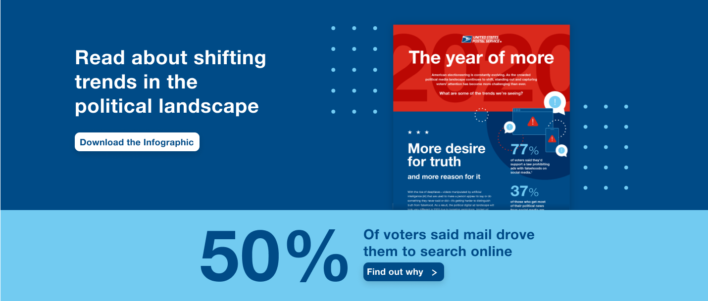
The site also featured relevant statistics and links to further research (which many participants found intriguing and interesting) in a way that wasn't obviously clickable. A large amount of appealing content the site had to offer was being hidden behind links that users didn't know to click on.
Our Recommendation:
Make this hover state only affect the background color, and not the actual text shown on the card. This would still help users visualize what was selected, but still allow them to see what content they were about to click on. Participants often noticed inconsistencies in the site which negatively impacted their experience and caused difficulties.
High cognitive load in deciphering search results
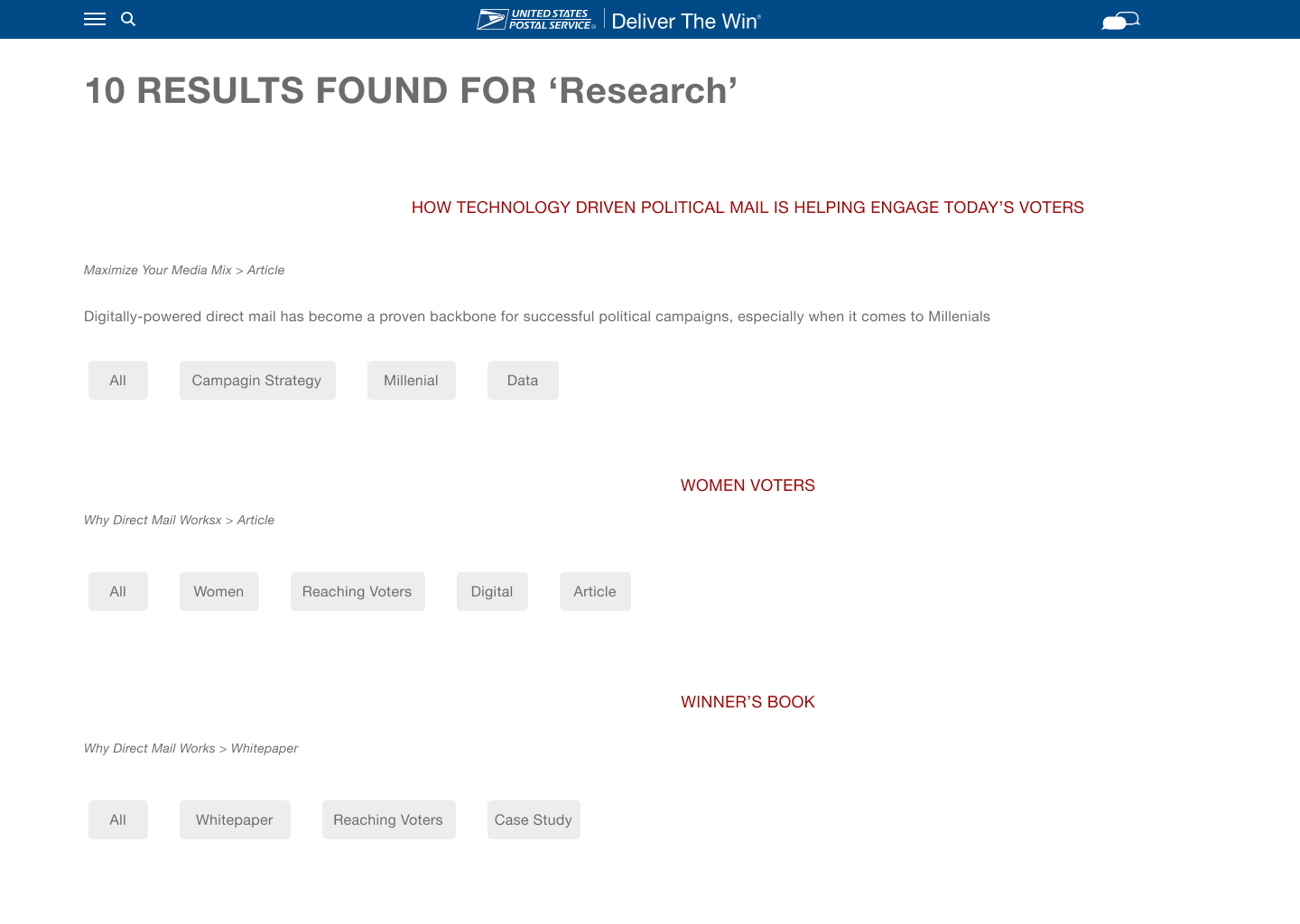
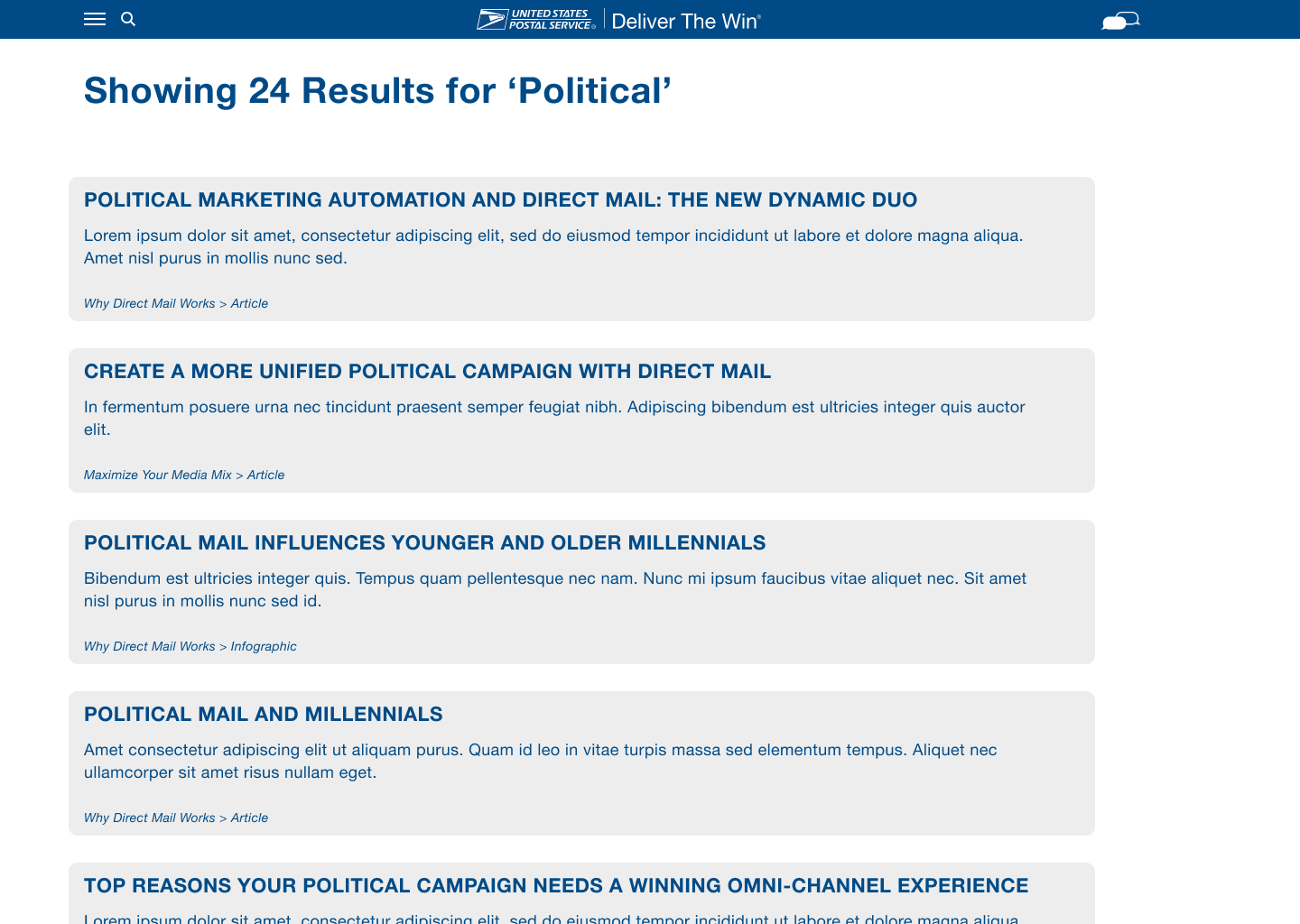
We also tested how users reacted to the search function on the site. We witnessed many participants experience difficulty getting to where they wanted to go from the search results page, most of this difficulty resulting from a lack of visual hierarchy on this page. Issues in alignment and spacing caused participants to have trouble correlating the clickable titles with the content they contained, and where this content was listed on the page. This also created an increased and unneccesary cognitive load on users.
Our Recommendation:
Redesign the search results page, left-aligning the results, grouping related content closer together and allowing for more whitespace between results
Conclusion & Reception
We shared the above insights and recommendations, plus many more, to key decision makers and stakeholders in January of 2021. Our suggestions were well received, and sparked discussion about changes to the aspects we recommended, as well as broader structural change to Deliver The Win.
If I had to do it all again...
My largest takeaway from this project would be that when collecting data, you can't be afraid to deviate from the moderator's guide when you feel it's necessary to. If a participant is encountering real problems and uncovering usability issues on one topic, it's much better to elaborate and dive deeper into that particular issue than to continue moving for the sake of "covering everything".
"Nick excels in moderating usability tests and identifying concrete and actionable recommendations that positively impact the agency's user experience and exceed client expectations. We are lucky to have such a valuable resource and advocate for the user."
The current iteration of Deliver The Win is accessible at Deliverthewin.com
